Buying guides
Adding a Name to a Custom Mousepad: Placement Checks
Keep names and short messages readable on a custom mousepad by checking contrast, crop, curved edges and the raised support before approval.
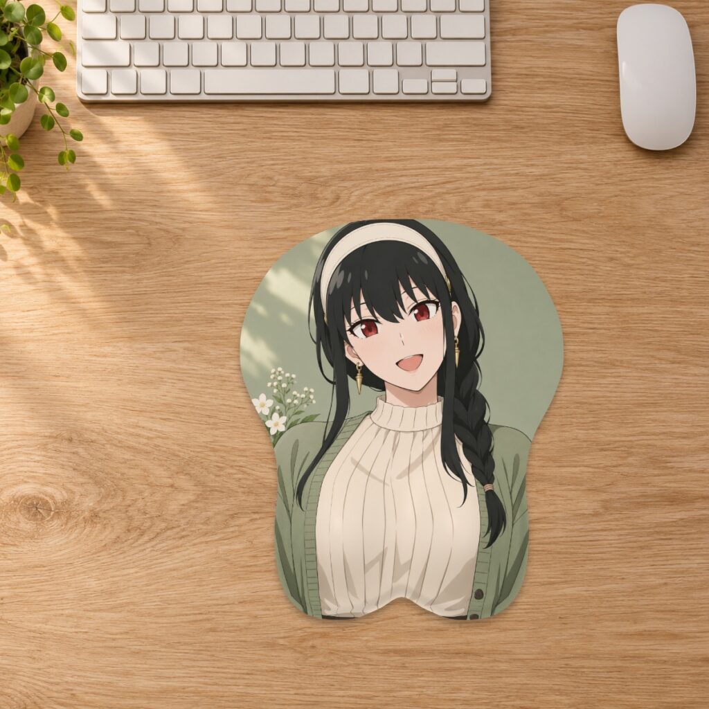
Keep names and short messages readable on a custom mousepad by checking contrast, crop, curved edges and the raised support before approval.
Choose the shape before adding the name
Treat text as part of the composition rather than an extra label placed at the very end. Select the intended family, size and style first. A name near the bottom of a rectangular image may land on the raised support or outside a curved edge once the artwork is fitted to the pad. Start in the custom studio and review the chosen shape before deciding where the lettering belongs.
Use a quiet area of the artwork
A short name is usually easier to place than a long sentence. Look for a visually simple area with enough contrast between the letters and their immediate background. Avoid positioning important lettering over detailed hair, clothing patterns or a busy scene. As a practical design check, view the composition at roughly the size you expect on the desk instead of judging it only while zoomed in. This does not establish a guaranteed minimum printable font size; fine details still depend on the source and production process.
Check the entire word after cropping
Fill pad covers the shape and can crop excess artwork. Fit image can preserve more of the source while leaving a border, but curved corners can still crop details. After moving, rotating or zooming the artwork, inspect the first and last letters as carefully as the center of the name. A word that looks centered on the rectangular source may sit unevenly inside the final outline. Keep important text away from the cut edge and raised support, as described in the custom artwork guide.
Review spelling and shape separately
Read the exact spelling, capitalization and punctuation in the flat layout first. Then use the 3D views to judge whether the lettering crosses a curved surface or the central groove. A clean flat layout cannot show every effect of fabric wrapping, and a convincing digital render is not a supplier-approved proof. If the wording is meaningful, ask another person to read it before you approve it. Do not rely on decorative lettering to hide a misspelling or a missing character.
Keep the editable original and the approved version
Retain the source artwork with its editable text if you have it, along with an exported JPG, PNG or WebP suitable for the studio. A screenshot is a poor master for later changes. Cropping and zooming affect effective resolution, so recheck the studio warning after changing placement. The artwork preparation guide explains this relationship. Save a separate layout for each selected size rather than assuming one crop will suit every option.
Ask about exact placement before ordering
There is no universal safe-margin measurement promised in this article. The final shape, cut and reviewed production proof determine placement. If a logo, name or short dedication must occupy an exact position, contact the store before ordering and identify the requirement clearly. Keep the accepted proof with your order records. Saving a design alone does not send it to production; an accepted order and reviewed proof are still required.
Prepared by the 3DMousepad store team using our product specifications and published store guides. Product illustrations are not scale drawings. Check the product page for the current options, price and availability. Ask us about your setup or suggest a correction.
Keep exploring
Taking a 3D Mousepad Between Desks
Plan how to carry and set up a raised mousepad without folding the support, packing it damp or relying on a product photo for scale.
Saving a Custom Mousepad Design: What Happens Next?
Understand browser drafts, saved layouts and production approval so you can resume a custom mousepad design without confusing a preview with an order.
Your New 3D Mousepad: A First-Day Checklist
Check your mousepad on arrival, compare it with your order, and document any concerns before cleaning, using or returning it.